

 Dutch
Dutch  German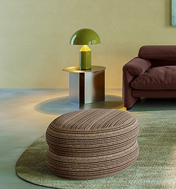
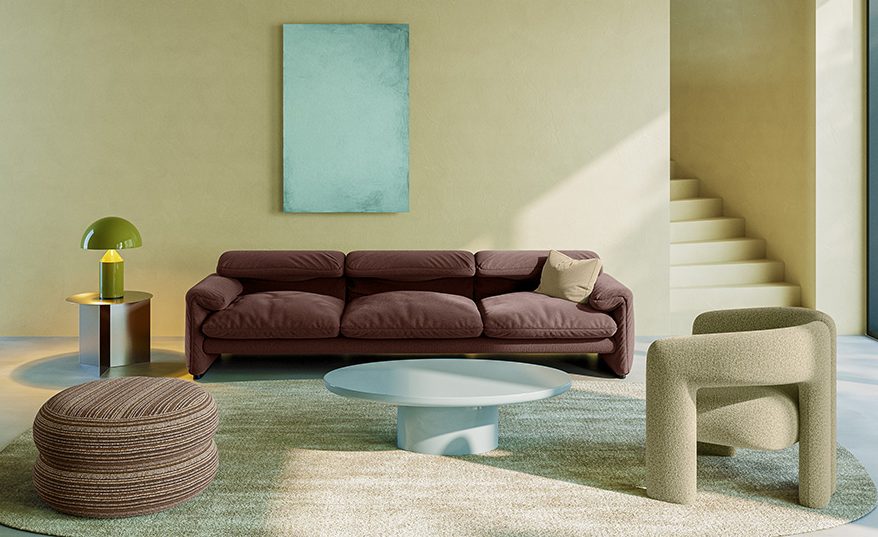
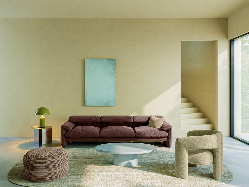
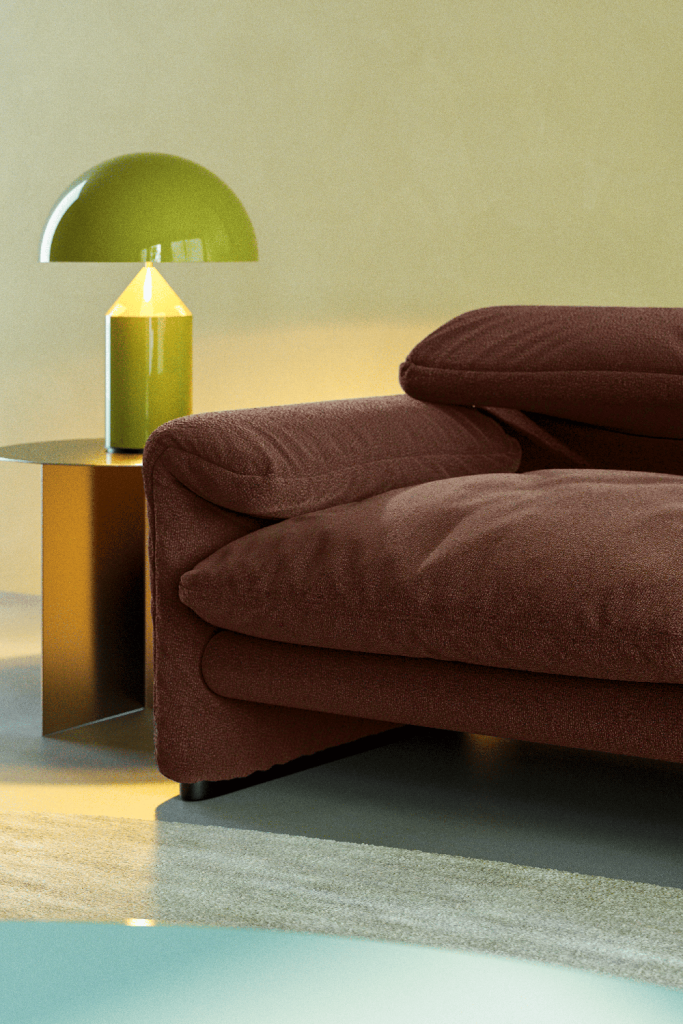
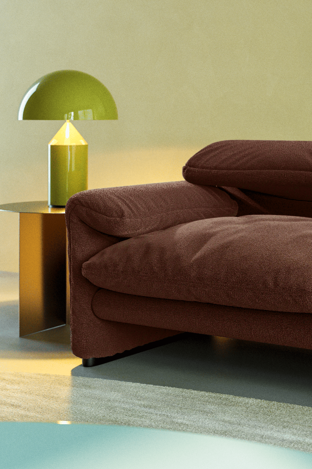
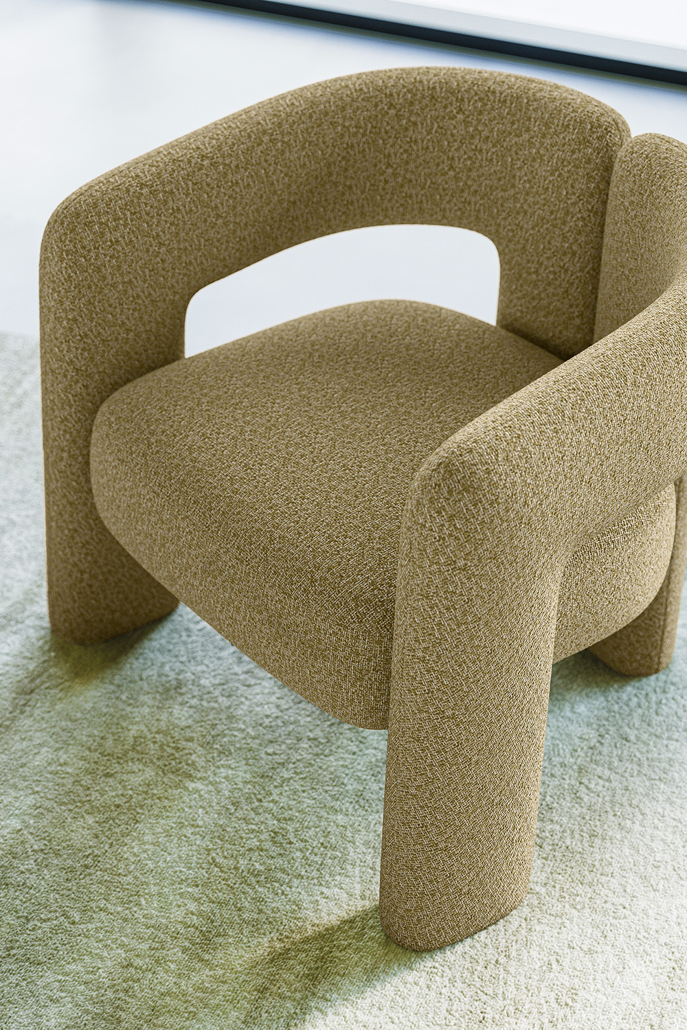
This direction focuses on the energy of unexpected combinations, where a mix of styles and eras creates a sophisticated tension. It moves away from predictable aesthetics towards a high-energy, playful style that adds a distinct sense of personality to a space.
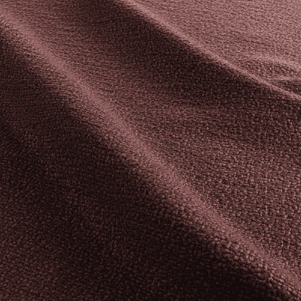
This expressive palette is reinforced by a sharp contrast in textures, where matte surfaces are placed alongside high-gloss finishes, and sleek materials meet voluminous, tactile structures to create visual layering. These elements are applied to a playful mix of forms, where organic curves and sharp geometric lines coexist. By layering bold colours, varied textures, and diverse shapes, the trend adds a
character-driven and contemporary energy to the interior.